")
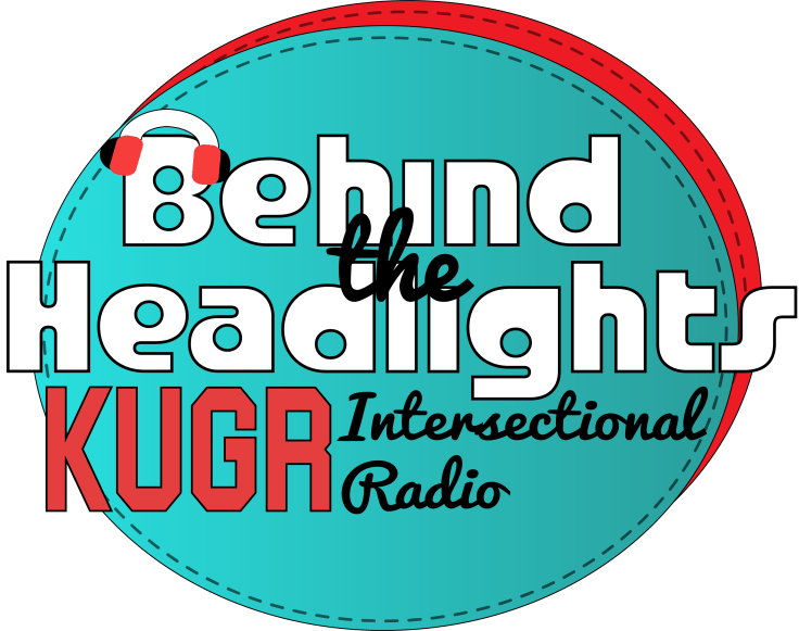
Above is the final version of the logo I’ve created for my radio show, Behind The Headlights. As my initial draft showed, I was very inspired by 90’s themes and aesthetic for this logo. My show is about intersectionality and highlighting artists and women of color working and creating in the music industry.
Since this logo represents not only this assignment but also my actual brand as a radio show, I took a lot of care and time in creating this logo and editing it to be exactly what I want. The colors I used came from some of my initial inspirations and colors I’ve used to advertise my show, and I really enjoy the combo of the specific teal and red shades I’ve used here.
Going forward, I kept the fonts that I used in the draft because I think they get the point and look of my logo across in a cohesive way. The text going off of the background is intentional and was meant to create depth in the image. Basically, my main goal in editing was to highlight the text and make it intuitive for the reader to see and understand the text and all the information in it.
As far as edits go, you can see the evolution of this logo from a drawn draft to now. Ultimately it hasn’t changed a ton, as I had a very strong sense of what I wanted it to look like from the beginning. The edits I have made though have been mostly subtle things that augment the current design and to try and make it more visually pleasing and easy to read.
The edits that I made were elongating the background circles a little bit so as to reduce the negative space above and below the text. This is because I noticed when using the logo in media that a wider and less round look would be a lot more versatile for advertising my show. I also added a pair of headphones that I created with some shape tools and extensive use of the direct selection tool to fit the headphones onto the ‘B’ in the title.
I also added dotted lines around the background to try and draw some more attention to the text in the middle. I’m very happy with the final look of this logo, as I think it has a much more cohesive look than the initial draft.

Leave a comment